
Story Card Layouts
Preview of the 3 card layouts: portrait (desktop default), horizontal (mobile default), featured (hero). Resize the browser to see auto-switch behavior.
Auto-switch (default)
Portrait on desktop, switches to horizontal carousel on mobile. No layout prop set.
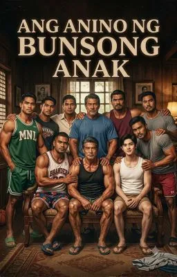
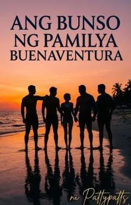



Explicit layout="portrait"
Always portrait, even on mobile. Useful when you want the cover-forward vertical layout everywhere.
Explicit layout="horizontal"
Always horizontal, even on desktop. Good for list views, sidebars, or dense story lists.
Explicit layout="featured"
Full-width hero card with 16:9 landscape cover. Great for featured/spotlight stories at the top of a page.
